What o8 did
Pragmatic start in 2017, 2021 time for a new level
Mind the Gap started out as an ambitious NGO founded by Karolina Decker, Leitha Matz, and Natalie Holmes. Early success showed clearly that there was a need for that initiative in the market – or rather: the world. With a pragmatic approach to the logo, for communication, for the website they had got quite far attracting lots of interest – and women attending their international events.
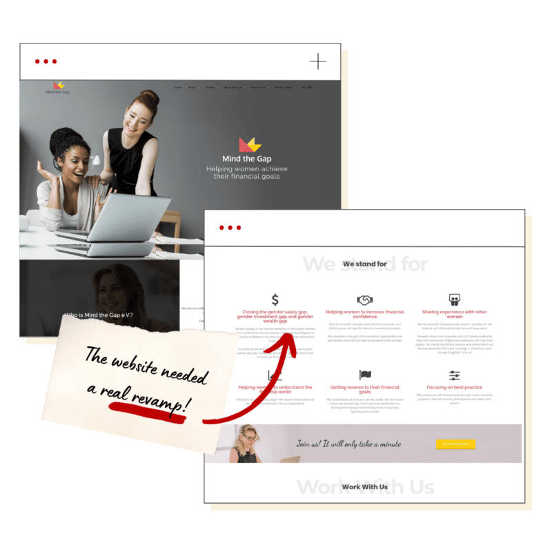
Time for a Decisive Before/After
Now it was about time to release its true power, make its vision easy to perceive and engage with, and get started with the next level. Having cooperated on other projects before, Karolina Decker reached out to our CEO Kristin to see what one could do to gain that leverage soon – at best within the next 3 months.
STEP 1
Detail Assessment & Recommendation
In lots of cases, the first step would be a vision workshop – in this case, this proved unnecessary as Kristin already knew what Karolina had in mind plus there already was lots of material that could be built upon.
So here a recommendation for the polishing, positioning, and main new messages was stage 1.
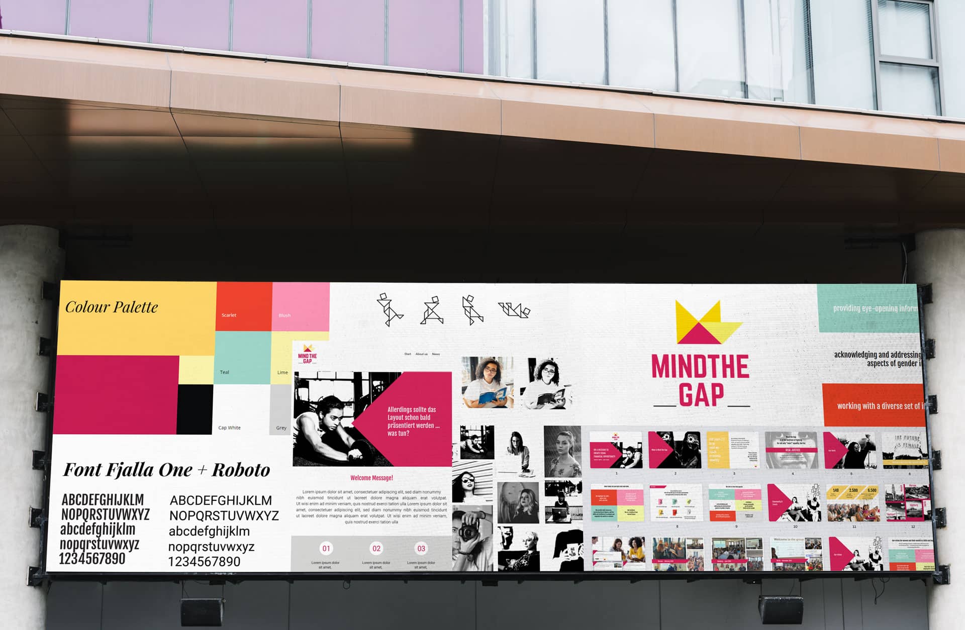
Hey, I got the perfect color palette – just found it last week!
This might be a bit unusual, but this is also how the creative part of our work at o8 works: We are always on the lookout for new inspiration, pinning and collecting them somewhere, maybe on a MIRO or simply downloading it. It might mean that Kristin, in this case in her role as creative director after the briefing directly snapped with her hands and said:
“Hey, I guess I got the perfect color palette – just found it last week!”

STEP 2
Design Brief
After we had checked in with the client team, now was the time to clean up the looks. This process starts with a written down design brief that makes sure that design does not creatively go astray staying always on brand, but also on positioning, target group relevance and overall business model.

BRAND TUNING
A new brand for more empowerment
- For the new brand aesthetic, we had a real close look at the existing logo: how can we keep it – and yet enhance its meaning (“it does nearly look like a crown” “how about those geometric elements – can we expand on that?”)
- Clearly, we needed to avoid any too girly or too manly approaches – neither would fit the bill here
- We saw using a characteristic way of handling imagery as one of the big opportunities in that topic (see below what this was translated to)
- If anyhow possible, there should be a slightly different look for B2C (future individual members) vs. B2B target groups (company and science partners…)

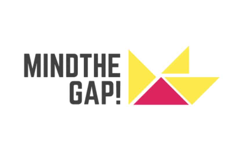
Approach 1
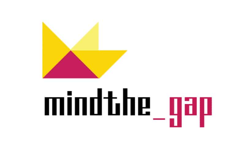
Approach 2

Approach 3
Boldness wins.
Indeed (as we usually advise) the bolder approach “won”.
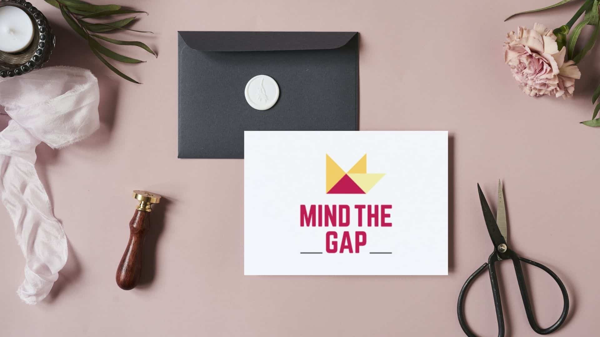
Boldness wins.
Indeed (as we usually advise) the bolder approach “won”: Electro concept.
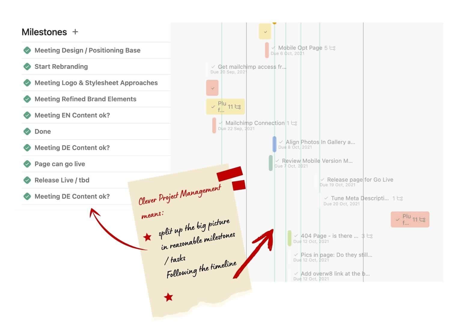
Clever Project Management
Working already on the content enabled us to shorten the overall timeline.

BRAND TUNING
A new brand for more empowerment
- Now that we knew what was needed, OVERW8 prepared a concept for the trade show that would convey the vision of esthra as clearly and incisively as possible. We
- took care of both the run-up and follow-up
- provided a concrete pre-selection for promotional materials
- suggested ideas for give-aways, outfits for the booth staff etc.
- Our challenge: creating a brand with a strong visibility that generates attention at the trade fair with relatively simple means.
SPECIALTIES
The Tangram
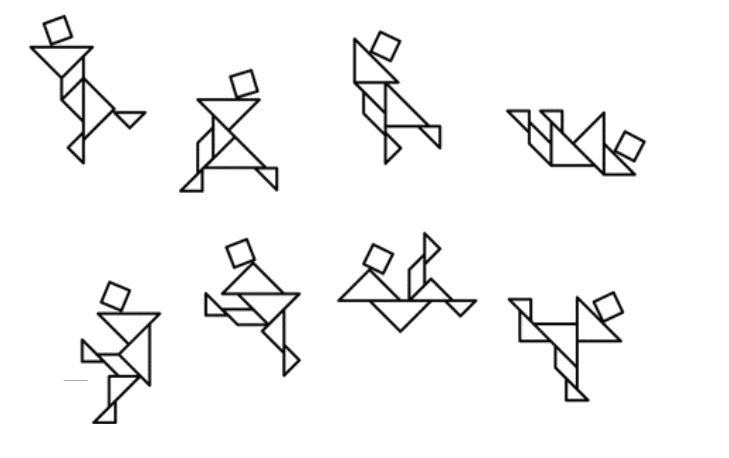
The existing logo provoked us playing with it – and we revisited the idea of a tangram. A tangram with its limited number of elements still provides the potential of creating a limitless number of figures. This linked in nicely into the notion that each woman is and should be allowed to be unique even though at the very base of it we are all made of the same material.
The tangram figures of Mind the Gap are a good example of how some elements of branding might be more about the nucleus of the idea, yet. At the moment they are used sparingly to help visualize the target groups on the page. In the future, however, they might easily evolve their potential in info material of all kinds, animated videos, or simply… compelling merchandise.
SPECIALTIES
2 Brand Lines for 2 Main Target Groups
DECISION MAKER / B2B
WOMEN / B2C
A strong imagery style
“Mind the Gap”‘s purpose is all about making the public aware of existing gaps. The perspective is meant to be very matter of fact rather than judgemental as this is alarming enough. The characteristic imagery is created by using an edgy reporter black-and-white style, therefore – such giving the opportunity to help differentiate between black and white also in a metaphorical way.



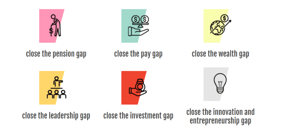
Especially in intercultural settings, icons help communicate and give orientation.
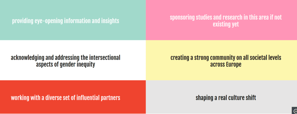
“Mind the Gap” dares to convey clear messages – this is visually underlined by the tiled look and the clear bold font.
STEP 3
Tuning existing, creating new content
In a case like this, we will probably try to build as much as we can on the already existing tonality, cleaning up on the way, creating new or more condensed elements where they are really needed.
For example, the main page will in most cases need a complete redo – whereas team profile texts in lots of cases just need a bit of polish or shortening.
Clever Project Management
Working already on the content while we were developing the new brand aesthetics enabled us to shorten the overall timeline.

Tada! New Website!
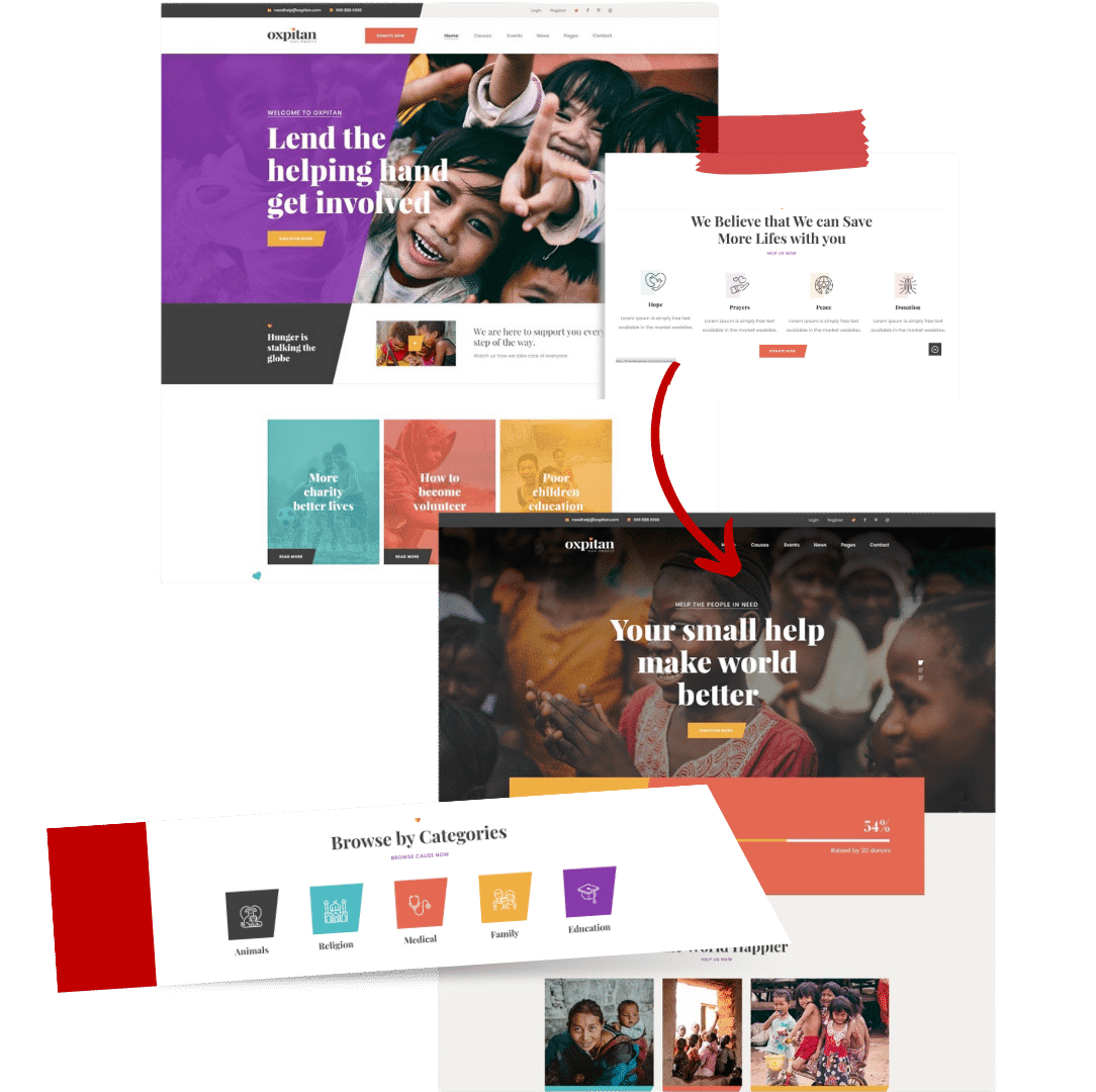
We can spill the bean: With all of this being prepped we were able to revamp the website pretty quickly.
We’ll work template-based – creating a shortlist of WordPress-based templates that already are pretty close in the overall look and feel so they ‘only’ need to get tweaked in terms of design.
Add to that well-prepped brand elements and content – and the puzzle will nicely align. In this case, we could even recommend a template that was well-prepped for the future with special donation elements, etc.
Go Live on October 15th
A SPECIALTY HERE
Video Tutorials for Special Functionalities
We like to help for self-help and like to enable clients’ teams to work themselves with their new hubs. In this case, the events functionality of the chosen theme was great in terms of UX, however, not so obvious ref. how to use it. In this case, we created video tutorials.
MAKE IT COMPLETE
Info Brochures
The leverage of an NGO such as Mind the Gap will heavily rely on getting the right partners on the game. Reaching out with some well-prepped info can be of huge help – so we supported MTG also with those.
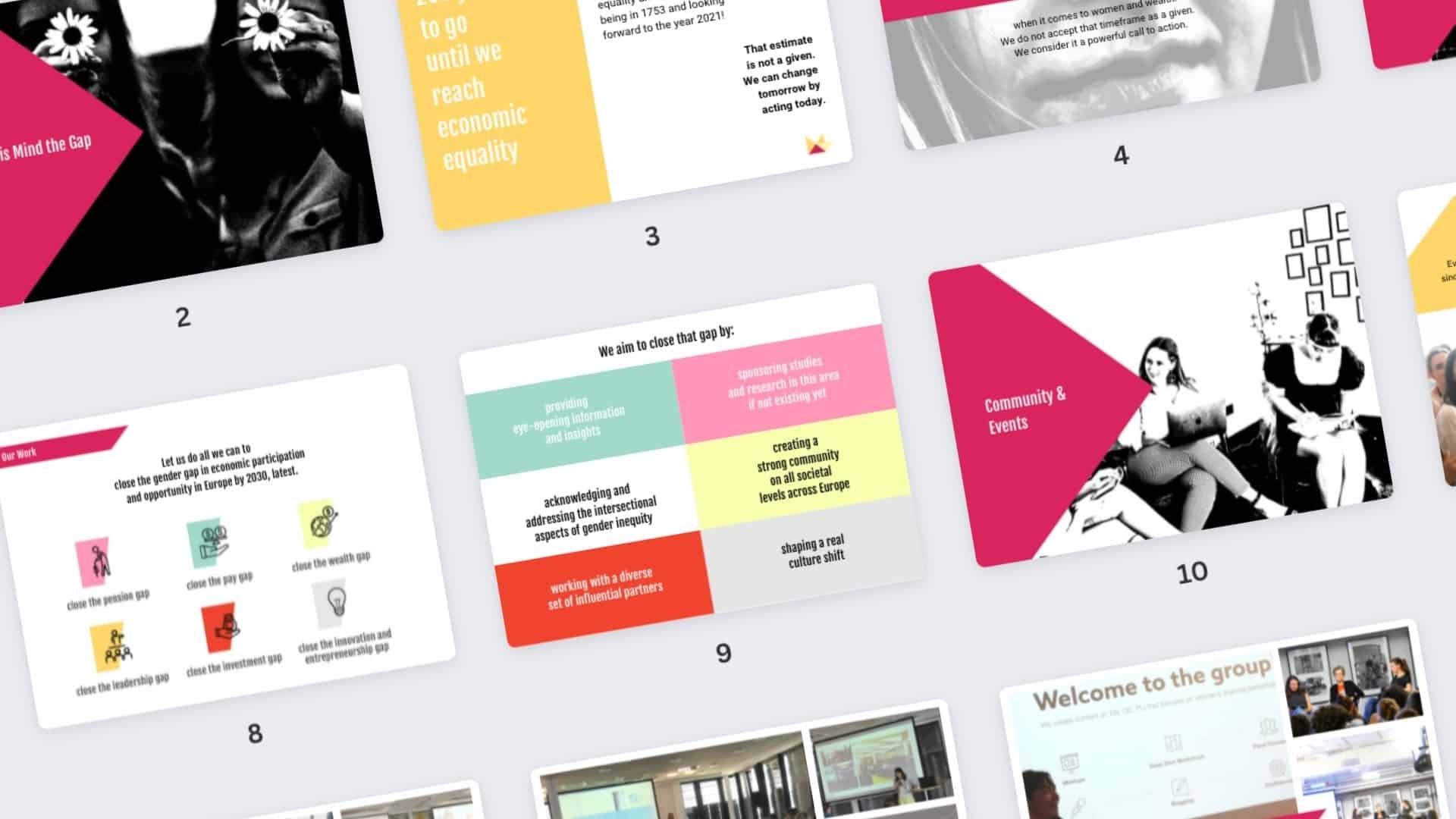
Tools
Our Tech Stack for this Project

Graphic Design: Adobe CC
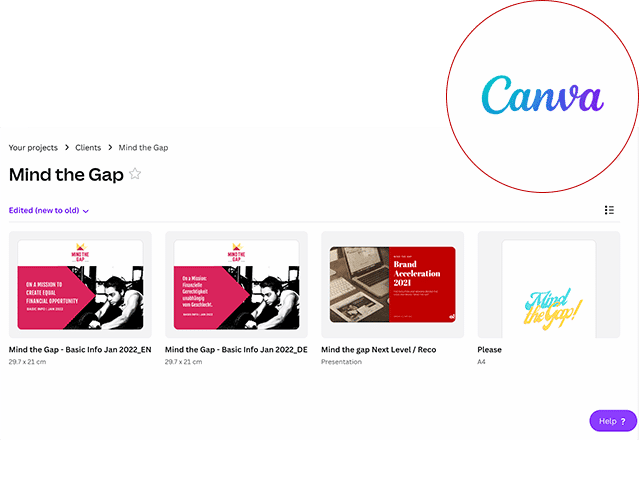
Graphic Design: Canva
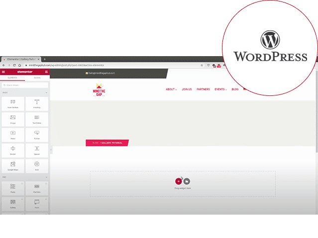
Web Development: WordPress
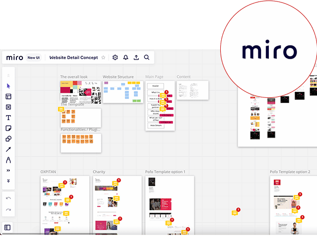
Website Structure + Brainstorming: MIRO
File Sharing: Google Docs + Google Drive
Project Management: Asana
The Cornerstones

This really sets us up for a new level!
Now, whenever I should doubt whether all my efforts are making sense, I will open our page, have a look at it, and just will feel great and proud about what we are doing here.
Karolina Decker

Want to do something similar?
Every situation, goal and company is different. We are happy to advise you to find out what suits you.


