

Where we started
ECHOLOT is an ambitious project for ‘new music’ that will take place for the 4th time this year.
It is organized by Kunsträume am See, the renowned gallery at the Starnberg Lake as well as the Kaske Foundation. Contentwise, the festival has always been a great success according to both the press and visitors. Unfortunately the well-deserved pride and cultural worth didn’t reflect in the existing communication (especially website, leaflets). Our team made it their task to close that gap.
Step 1:
The Objective
As so often, the first step was to sit down with the decision makers Elisabeth Carr and Manuela Hartel and understand their vision and expectations. On this basis we worked out a detailed briefing, which was finalized together and approved. Since there were several important decision makers (in the background there was also Artistic Director Gunter Pretzel), the conceptional consensus was especially important here.
Step 2:
Polishing the brand
In a case like this, several options will first be created to play around and discuss with the customer and finally polish.
Logo Makeover and Brand Elements
The festivals unique atmosphere needs to become more experienceable beforehand. The ‘New Music’ is a highly innovative kind of classical music, disruptive und unusual. From the very beginning, the digital video art by Manuela Hartel played a huge role in visually translating the acoustic impressions. Both were supposed to be clearly recognizable in the logo, fonts and colors.
Special Branding Elements
Yes, of course we wanted to keep it clean. But such an avant-garde topic is basically asking for a more unusual style. So we treated ourselves to a few ‘specials’.

The Digital – The New Music – The Masks
The Digital
We chose ‘Anaglyph’ as the main filter. This filter visually expresses the movement of the sounds and makes the sometimes outdated looking images of musical instruments more lively. At the same time it works great for all three elements, that are so essential to the festival (people, music, surroundings).


The New Music
New Music is in many ways different, a new approach and way of realizing it. This also translates to the way music is written down. Instead of ‘normal’ notes, visual elements are used. A very characteristic element in the world of New Music – and a MUST for the overall look.

The Masks
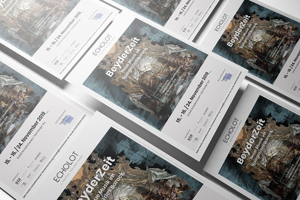
The festival is closely connected to it’s location, Schloss Kempfenhausen. Creative Director Kristin Reinbach immediately noticed the characteristic masks on the walls of the great hall. Based on photos she took, these elements were developed further to become statement elements. While the festival has a different motto every year (in 2019 “BeyderZeit”), these masks will ensure a visual recognition throughout the years.
Step 3:
Makeover for the Website
The website was created on WordPress before. It was noticeable that time and budget for this had been scarce so far. Technically it needed to be cleaned up and made more secure (lack of security measures had lead to a lot of spam and other deficits). Afterwards it was basically completely refurbished.


How did we get from ‘before’ to ‘after’ so quickly?
It’s the combination of the Brand Makeover and the smart utilization of existing WordPress templates, that allowed us to come to such fast results.

Hero Pics by Visual Artist Manuela Hartel
In this case the artists worked closely together with us. Manuela Hartel wanted to use the chance, to represent the exhibition about her Hero Pictures – so of course we integrated it.


The Artistic Concepts and Texts
In a case like this, words are a crucial point, to communicate the artistic idea. At the same time, artists are not necessarily copywriters – so we refined it a little bit.
The Artist Profiles
The artists are obviously a crucial part of the festival. We completely renewed their profiles visually and text-wise, so they will look their best.

Mobile Event View
Nothing is worse than event pages, that can’t be used on a smartphone properly – especially pages in the leisure sector already have up to 90% mobile use.


Step 4:
Posters and Leaflets
The so called “Collaterals“. After setting a solid base with the stylesheet and cleaned up contents, these were created and discussed in no time.


Key Figures
In this case a combination of invoice and sponsorship by OVERW8. About 5 figures.
8 weeks from start to final result.
ECHOLOT as a festival was set up by their hosts KunstRäume am See and Kaske Foundation for the long run. With this new communication platform, ECHOLOT is all set up not only for this, but also the following years. The main basics were built to have timeless messages just as clear as the space to create future festival mottos.
Very reasonable, 2 in-person meetings.
For this project it needed two in-depth meetings that each took an afternoon. One for the kick-off workshop and one after finishing the website draft.
The development of the sheet, new logo etc. was discussed remotely, working closely together with Manuela Hartel. Texts for the artistic concept were easily coordinated with artistic director Gunter Pretzel via the phone and using Google Docs, despite wifi issues.
Despite different ways of work, different generations and a tight schedule, we were quickly able to accomplish a very positive improvement.
Process Tools
At OVERW8 we use a broad portfolio of digital tools and frequently test new ones as well. Some standard tools that are always used in project management are Asana + Slack. Further tools are usually chosen according to the project and its people. Some tools will only be used internally by the team, others together with the customer. In this project, only one of the project partners was involved in Asana. Google Docs once again was a very useful and efficient common denominator that worked reliably across generations and despite a bad internet connection – even for complex text- and concept decisions.
