


The Bigger Picture: 1936 | A first try under worst circumstances.

Celebrating the Iconic Brand Design by Otl Aicher: 50 Years Olympic Summer Games Munich 1972
This article is part of something bigger – i.e., our “design trendwatch whitepaper” celebrating the iconic brand design German designer Otl Aicher and his team developed and filled with life. Would you have guessed a story about design would include the story of positive change, of evil roots providing the soil to silently but effectively build something new? We were also as surprised as hooked – and we’re happy to share these timeless insights as inspiration for using great brand design as a way to build the future. Get to know more about it and maybe join us in that endeavor!
Before we head right into 1972, we need to give you some bigger context, so you get the chance to grasp the story’s true meaning. Most people will not be aware that the 1972 Summer Games in Munich have their roots in a disastrous past.
The 1972 games were intended to create a “phoenix from the ashes” moment, a reinvention of a better, more joyful Germany, maybe even creating a door for healing.
We will not dwell too much on this but just let the pictures speak for themselves; building on this, we will then be happy to reveal why this is so important for creating the 1972 games’ look and feel.
The Context
- The 1972 games were only the second time that Germany was the host of the Olympic games. The first time was in 1936.
- Taking place in 1936, this was pretty exactly three years before World War 2 broke out. And only two years before the “Reichskristallnacht” happened, that massive pogrom openly tried to destroy as many Jewish businesses as possible.
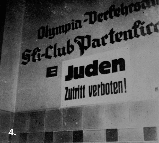
- Obviously – and a tiny bit contrary to the current public narrative – the exclusion of Jews from public life had already occurred (see the Garmisch picture).
- The roots of evil had already been sewn and flourishing, and strong symbolic and emotional manipulation was used to cover up the bad things already happening.
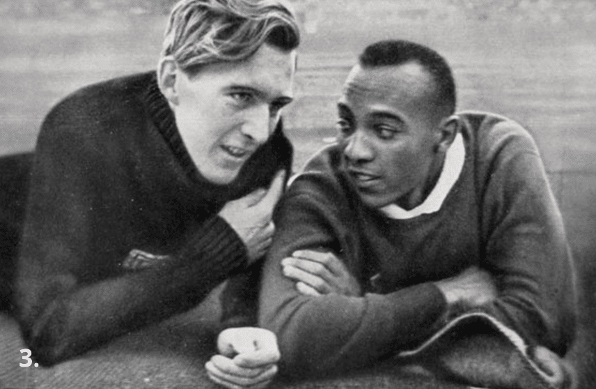
- The U.S. did not buy into that and officially threatened to boycott the games should Jewish athletes not be allowed to participate. Nazi Germany rowed back a bit on that, allowing them officially to participate, which led to absurd and heartbreaking stories such as a female fencer who had already emigrated to come back participating for her home country, putting herself clearly at risk.
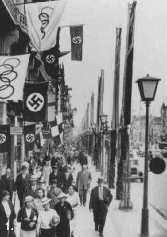
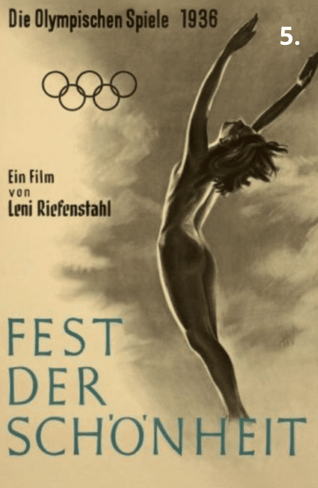
- The visual narrative also there was an essential part of the experience. In this case, more shaped by the already existing standard tools and messaging of Nazi communication and propaganda (think torchlight processions). They were pros and thought 360 about shaping the narrative – so they hired Leni Riefenstahl to help with this.
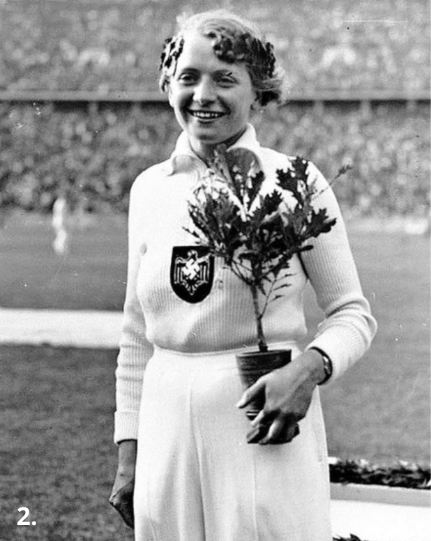
- The aesthetics of those 1936 games had been Leni Riefenstahl’s. Very iconic and, in a way, brutally honest – celebrating the Arian race and its strength and uprightness. We see a visual narrative of strong, agile people, the oak trees given to the winners (future, strength, Celtic). This kind of narrative was part of a bigger nasty game.
All of this made creating the visual narrative of the 1972 games a special challenge.
Otl Aicher: The man behind the 1972 games’ aesthetics
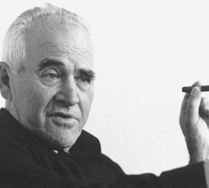
Otto “Otl” Aicher was born in Ulm in 1922 and was to become one of Germany’s leading graphic designers and typographers.
In his youth, he was a close friend with Werner Scholl, whose family was known for their involvement in the White Rose (the Anti-Nazi resistance group). Two of Werner’s siblings, Sophie and Hans Scholl, were executed in Munich in 1943 for being members of it.
Aicher himself refused to join the Hitler Youth and was arrested in 1937 (age 15), later forced to join the German army during the Second World War.
In 1945 he deserted the army and the Scholls let him hide at their residence. After the war ended, in 1946, Aicher joined the Academy of Fine Arts in Munich to study sculpture, and the next year he launched his own studio in Ulm.
He married the eldest Scholl sister, Inge Scholl, and co-founded the Ulm School of Design, which became a successful art institute till its closure in 1968.
What if… a person so close to the Nazi victims was about to create a better version of Germany – through the means of design?
This is chapter 1 of 6 of our Design Trendwatch special about Otl Aicher and his iconic brand design for the 1972 Olympic Games in Munich – check out the other parts here:


Or, if you’d like to enjoy the full-blown beauty of this nicely layouted whitepaper, be sure to download it here now:


Leave a Reply