

Designing the Olympic Games 1972: The Vision of a New Germany

Celebrating the Iconic Brand Design by Otl Aicher: 50 Years Olympic Summer Games Munich 1972
This article is part of something bigger – i.e., our “design trendwatch whitepaper” celebrating the iconic brand design German designer Otl Aicher and his team developed and filled with life. Would you have guessed a story about design would include the story of positive change, of evil roots providing the soil to silently but effectively build something new? We were also as surprised as hooked – and we’re happy to share these timeless insights as inspiration for using great brand design as a way to build the future. Get to know more about it and maybe join us in that endeavor!
Otl Aicher: Pre-Olympic Work
 When Aicher visited Japan in 1960, he experienced first-hand the limitations of non-written language in communicating with foreigners. He realized the need for a comprehensible pictorial language to work across cultures.
During the 1950s, the term “corporate identity” was applied to the set of visual standards and style guides for companies to follow. Aicher’s strongest interest was in corporate branding; he and his team developed 1962 one of the most exceptional corporate identity designs for Lufthansa. Aicher recommended the “melon yellow” as the main signature color.
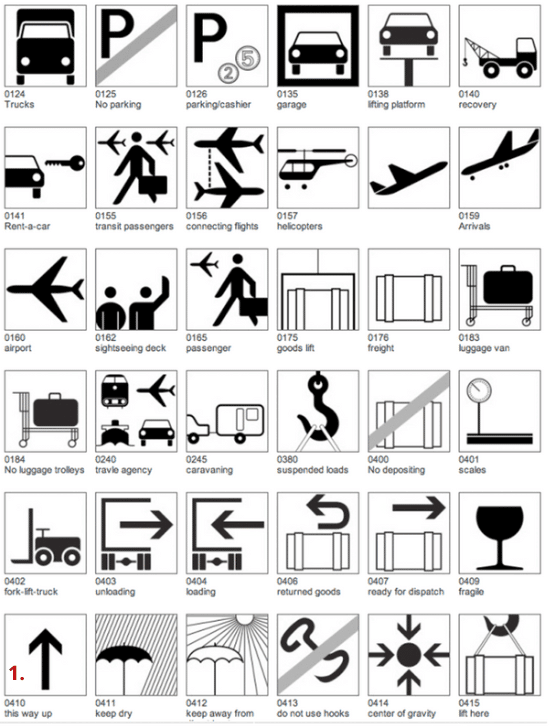
In 1971, he designed a gridded sign system for the Frankfurt airport with simple geometric forms and a figure with a dot for a head and a rounded rectangle body. The form has just enough to be recognizable as a human figure.
When the Summer Games 1972 were around the corner, Otl was more than well-prepped for the task at hand.

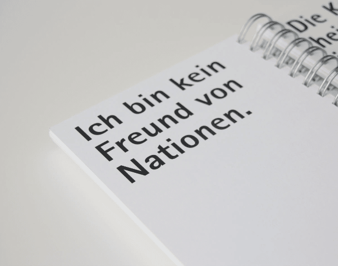
“I am not a fan of nations.” – Otl Aicher
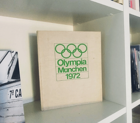
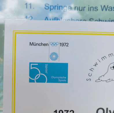
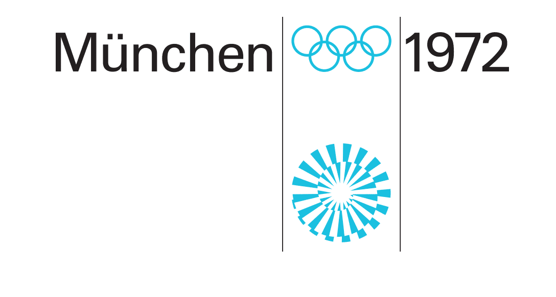
Otl Aicher’s most legendary work is the graphic design commissioned for the 1972 Summer Olympics in Munich.
Aicher consulted first with Masaru Katsumie, who had designed the previous 1964 Tokyo Olympic Games. Aicher approached the Olympic Games project task as he did with corporate clients.
The company was the Federal Republic of Germany.
The idea behind the brand became:


They were to be cheerful, modern and democratic, without pathos and gigantism, in complete contrast to the 1936 Olympics of the National Socialists in Berlin.

 Source: https://www.kickstarter.com/projects/niggliverlag/the-design-manual-of-munich-72-the-joyful-games
The next 50 years will be exciting. – Otl Aicher
The whole project presented the new era of Germany on a global scale using Modernism as a style.
Everything had to display the same design unity: the logo, the flyers, posters, uniforms…
even the trash cans had to be ‘on brand'(!).
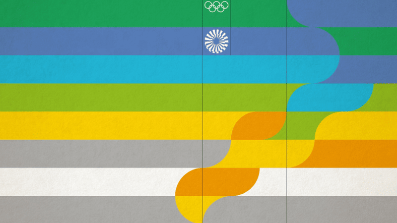
The color scheme was meant to be “light-hearted” and focused on the Regional Bavarian color palette of silver and blue, combined with a “rainbow palette,” a statement of diversity.
The pictograms the team created were made up of the simplest shapes using a design grid; they had so much dynamism and were universally understood.
His futuristic and timeless vision with his iconic design has made it possible to still use the symbols (after almost 50 years) as a standardized visual language.


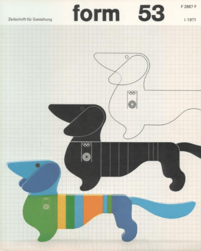
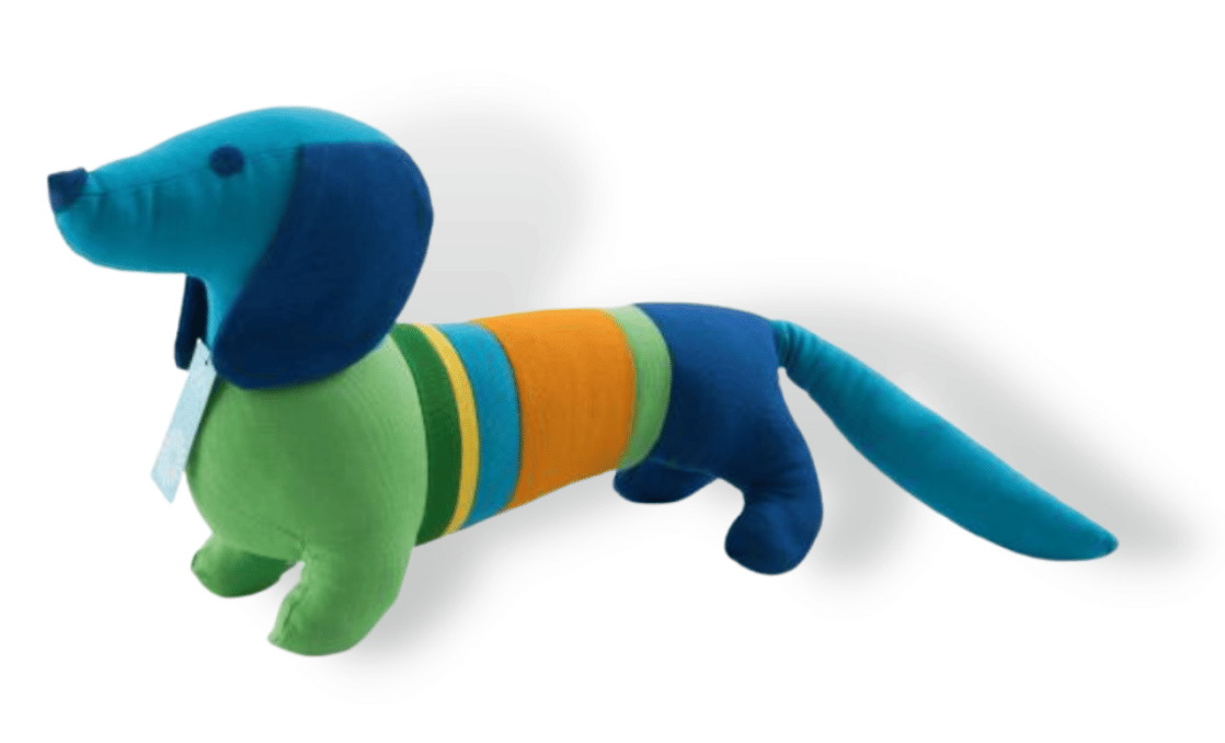
Aicher is also credited for leading the design of the Munich Olympics logo and the first official Olympic Mascot, the dachshund “Waldi”.
Indeed, of course, lots of it was excellent teamwork.
In this case, Elena Winschermann, a graphic designer from Munich, took over the design area around the souvenirs.
The Olympics Brand Manual

There is still so much interest that the Niggli Verlag successfully did a Kickstarter campaign for its reprint that quickly sold out.
It is so simple, so well-structured, clearly understandable and educational as basically everything that Aicher created. – Michael Klar, designer and friend of Otl Aicher
This is chapter 3 of 6 of our Design Trendwatch special about Otl Aicher and his iconic brand design for the 1972 Olympic Games in Munich – check out the other parts here:


Or, if you’d like to enjoy the full-blown beauty of this nicely layouted whitepaper, be sure to download it here now:

Leave a Reply