Otl Aicher Design Special: How to…Establish A Legacy through Brand Design
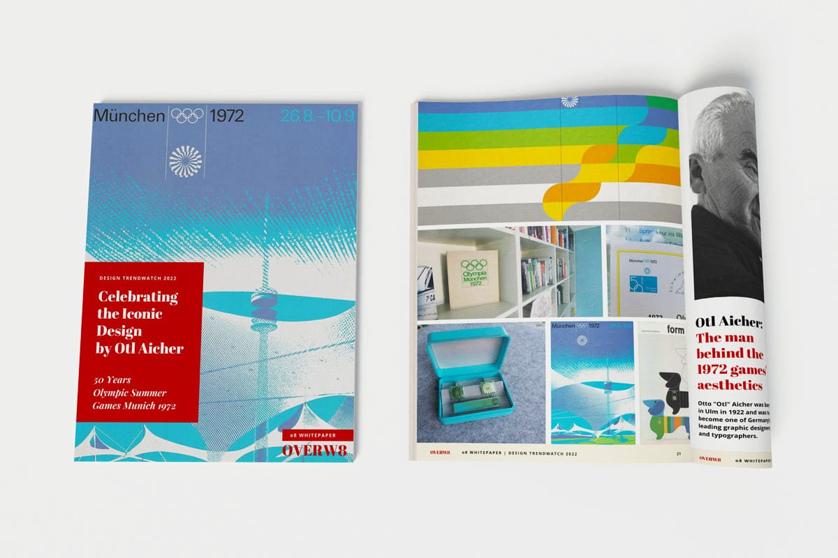
Celebrating the Iconic Brand Design by Otl Aicher: 50 Years Olympic Summer Games Munich 1972
This article is part of something bigger – i.e., our “design trendwatch whitepaper” celebrating the iconic brand design German designer Otl Aicher and his team developed and filled with life. Would you have guessed a story about design would include the story of positive change, of evil roots providing the soil to silently but effectively build something new? We were also as surprised as hooked – and we’re happy to share these timeless insights as inspiration for using great brand design as a way to build the future. Get to know more about it and maybe join us in that endeavor!
Aicher’s and the Ulm School pupils further design work
Aicher also created the corporate design for companies such as Erco, Lufthansa, Braun, BMW and FSB.
In 1980 Otl Aicher started a collaboration with Bulthaup.
He believed that the kitchen should be an inviting place where meals are prepared together, where all the required tools and implements are clearly visible and stored within easy reach.
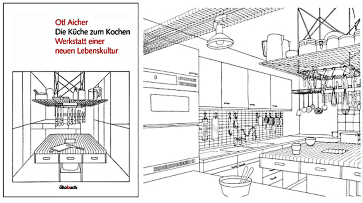
In 1982, he published his book “Die Küche zum Kochen”.
For his research, he visited chefs in star restaurants to talk to them about their kitchens. According to him, a designer who designs a kitchen must be able to cook:
“Designers who don’t cook shouldn’t be allowed to touch kitchens in the first place.” – Otl Aicher
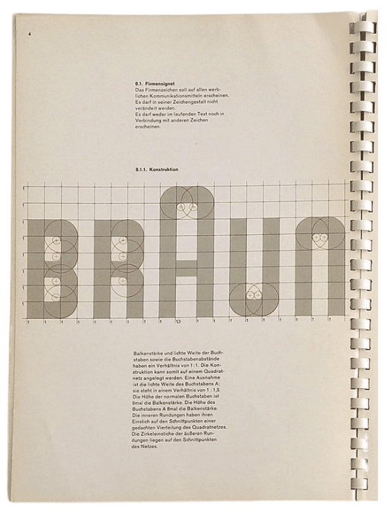
From the beginning, the Braun logo had its characteristic “A.” Braun’s goal was to develop products that meet the needs of the consumer, that are always one step ahead of the competition in technology and design.
In the mid-1950s, Ulm professor Hans Gugelot and his student team revamped the image of the entire Braun product line (portable radios to music equipment) while working with industrial designer Dieter Rams in only eight months.

What made the Ulm designers different was their radical approach to design.
1959, Herbert Lindinger, a student from a Development Group with Braun, designed an audio system that looked like a piece of engineering. His audio system became the model for Braun’s 1960s audio program.
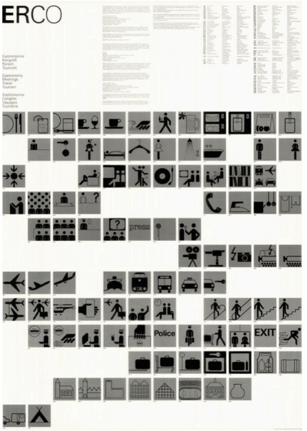
“Aicher’s work for ERCO has become an example of modernist design, which successfully establishes a relationship between design and industry and the importance of branding and visual communication. This clearly shows how important Aicher was to the industry world as he helped communicate the company image through the power of design.” – Billy Adams on Medium
In a way, Germany’s post-war look & feel are highly influenced by Otl Aicher’s work.
His main contribution to type design is the font Rotis (1988).
Aicher was obsessed with clarity and went on to create a typeface called Traffic (for Munich’s public transport). The font became very popular again in graphic design in the 90s.
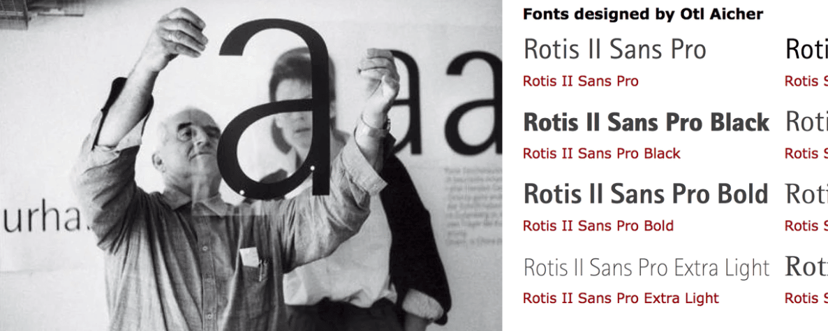
Have you seen Otl Aicher’s pictograms or fonts lately?
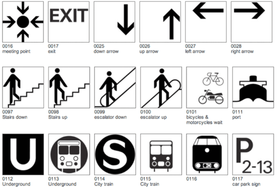
Otl Aicher and today’s design
Aicher’s vision of making a Corporate Brand out of the Olympics is something that revolutionized the design world.
Customer Experience: Implemented before the term even existed
We can see today that even experiences can be branded and that it’s a process of thinking carefully about every single “touchpoint”, from the very first interaction with the brand (watching the Olympics logo on TV) to the very last (buying a Waldi souvenir). This is what has evolved now to “customer experience”, which as a term didn’t exist 50 years ago, but they were already doing it.
Customer experience is also very much in line with the “Ulm model” because experienced designers have to dig deep into a research-based activity, and it’s not only based on aesthetics, it’s much, much more because it’s reaching users (or in the Ulm model case: society).
Interdisciplinary and thorough
Ulm has already integrated various disciplines into its curriculum (more than only visual), such as the ones needed in UX design, making the designer “work as a team player, not just an artist.” A branded product has intrinsic attributes that the company and society add: luxurious, high quality, cheap, innovative, fun, etc. This creates in our minds a value for this product or service and depending on how strongly we feel about it, it can move our own ideologies (see also the Ulm philosophy).
The use of a “functional visual language” like the one developed by Aicher, is now applied to most design fields.
The grid system they implemented is a timeless mechanism to give design uniformity, also used for one of Aicher’s most important developments: the set of icons. Icons nowadays are everywhere because they are universally understood, and it has become of much importance to user interface design, infographic design, and signage.
Icons, especially in digital brand design, have become essential to users; they not only enhance the aesthetic but also simplify the core information about the action or idea they represent, to understand them instantly because…
“a picture is worth a thousand words.”
As Otl Aicher’s approach was customer-focused and value-based, it was more true brand design than “just” design.
The beauty of the Braun design in the Aicher era is that their main focus on functionality makes it timeless and that the designed pieces belong visually to the same “system” (another UX design term!).
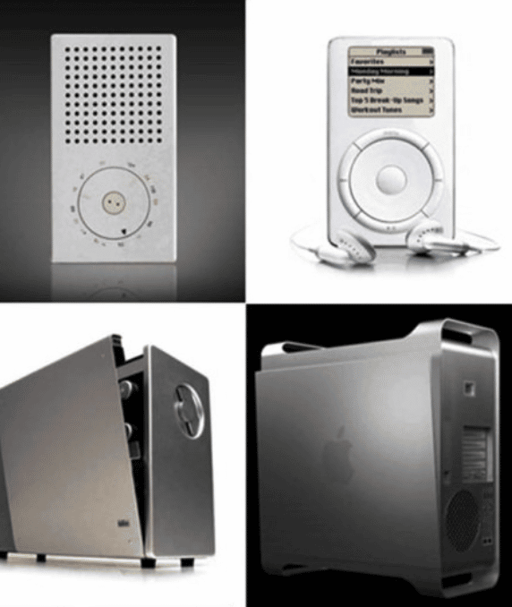
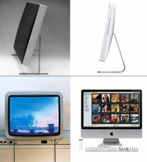
Did you know that the Braun design system has served as an inspiration for the design of Apple? (yes, that’s right).
Apple used the forms and colors to create the classic shape of the iPod, the iMac and even the internal calculator is similar to the Braun calculator!
A design system is defined by Invision app as
“… a collection of reusable components, guided by clear standards, that can be assembled together to build any number of applications.”
This design system eliminates inconsistencies, saves precious time, and creates unity throughout the design. UXpin defines it as:
“Design scales. But it scales only with a design system. A design system is a set of standards for design and code along with components that unify both practices. Think of it as the same instructions and Lego kit for everyone.”
Aicher and the design team were thinking far ahead of time.
This is chapter 4 of 6 of our Design Trendwatch special about Otl Aicher and his iconic brand design for the 1972 Olympic Games in Munich – check out the other parts here:
Or, if you’d like to enjoy the full-blown beauty of this nicely layouted whitepaper, be sure to download it here now:




Leave a Reply