


How to choose the colors for your brand: (Almost) no matter of taste
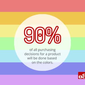
What if…the right color brought you 21% more sales every year?
With the right choice of color in branding, you cannot only strengthen your brand; you can even specifically influence the perception and behavior of your customers. Within the first 90 seconds, people decide about a product or a person.
In this article, you will get essential basics about the impressive effect of colors and what you can do so that your brand, among other things, develops optimal sales power with them.
Market Match: How to hit the bull’s eye with color
So the goal is to ensure that the colors chosen in your brand world hit the mark with your target audience. To do so, first, we need clarity about your target groups and their (color) preferences.
As already indicated: With the right choice of color for your product or service, you can influence much more than just purchasing decisions. You can even influence – or maliciously put: manipulate – a very concrete behavior.
Thus, the color scheme of a product can, among other things
- “stimulate or satisfy the appetite,
- lighten the mood, calm down customers or
- reduce the perception of waiting time.”
Which color hits like a bomb?
The role of color psychology
Yes, we all have a favorite color, but each has a different one! And as in marketing applies:
The bait must attract the fish, not the fisherman.

So the entrepreneur’s own favorite color may or may not be a good choice.
In case of doubt, you should seek the advice of experts and make use of color psychology. In this exciting field of research, we specifically investigate which bait tastes which fish and why 😉
The central research areas of color psychology deal with factors like:
- what shapes the perception of color,
- how colors affect different people and
- what the connection is between brand perception and colors.
The topic of color psychology in marketing fill books, so here are a few particularly interesting aspects to get you started. Their primary purpose is to give you a sense of the tremendous leverage of your decisions in this area.
1. The reason why some love pink while others don’t
Our wealth of experience with a color in the course of our lives, i.e., “how often and in what context did I have to do with green things in my life, for example” (green apple, green carpet, green traffic light, etc.), adds up over time to a so-called association field.
That’s exactly why not everyone likes pink.
Everyone ultimately likes the colors with which they associate nice things,
concluded the researchers of a study on individual color perception based on our experiences.
That could be pink, but it doesn’t have to be. In addition…
2. “Men from Mars, women from Venus” – still valid?
Indeed even in the color selection, it still shows that men and women do not share the same language – or at least get trained to (our CEO Kristin with her background in intercultural studies would always second the latter). In a study by Joe Hallock, 232 men and women from 22 countries were asked about their color preferences. As of today, men prefer blue, while women prefer purple.
When you think about the typical boy and girl baby romper colors, it becomes clear how much of an influence this has on the cultural environment:
- Light blue is still mostly used for boys and
- light pink / light purple is often chosen for girls.
Combined with point 1, this means:
The girl experiences a lot of “pink” AND a lot of love at the same time so that she could develop a higher inclination (or aversion!?) to this color, the boy accordingly.
What is interesting about this is the fact that, in principle, another color, such as red, could also be similarly positively ‘charged’ if the positive charge were broadly anchored culturally in a similar way.
3. Even blue is not as simple to use as one would assume
Another study concludes that color preference has to do with our need for health and survival. This could explain why blue is a popular color across cultures. For example, if you think about the blue sky, everyone is happy about the good weather. That makes perfect sense.
However, for other shades of blue, the situation is different (see graphic).
Would you have guessed this finding?
In the U.S., blue is associated with patriotism, while it is associated with mourning in Iran.
Since the so-called “American Creed” is ‘massaged’ into the brains and hearts of children in the USA (“star-spangled banner”), at a second glance this is not as surprising AND gives us a good idea of how enormous the cultural influence on our color perception is.

What are the right colors for your brand?
After all, through well-done marketing, we want to work with our customers to make their brand and offer stand out positively to this target group and make people remember them well.
Colors are an essential element in making the brand world visible and tangible to the outside world.
So when we sit down with our clients, we usually start with a conversation about what the “world” or “atmosphere” they want to create with their brand looks like.
- What do you want your company to stand for? How do you want your company to be perceived?
- What kind of feeling do you want your customers to get when they buy a product or service from you?
- What makes your company unique? How does it stand out from other companies in your industry?
Brands have a personality that translates into color
Before we get to what we do with the results of these workshops, you need the following background.
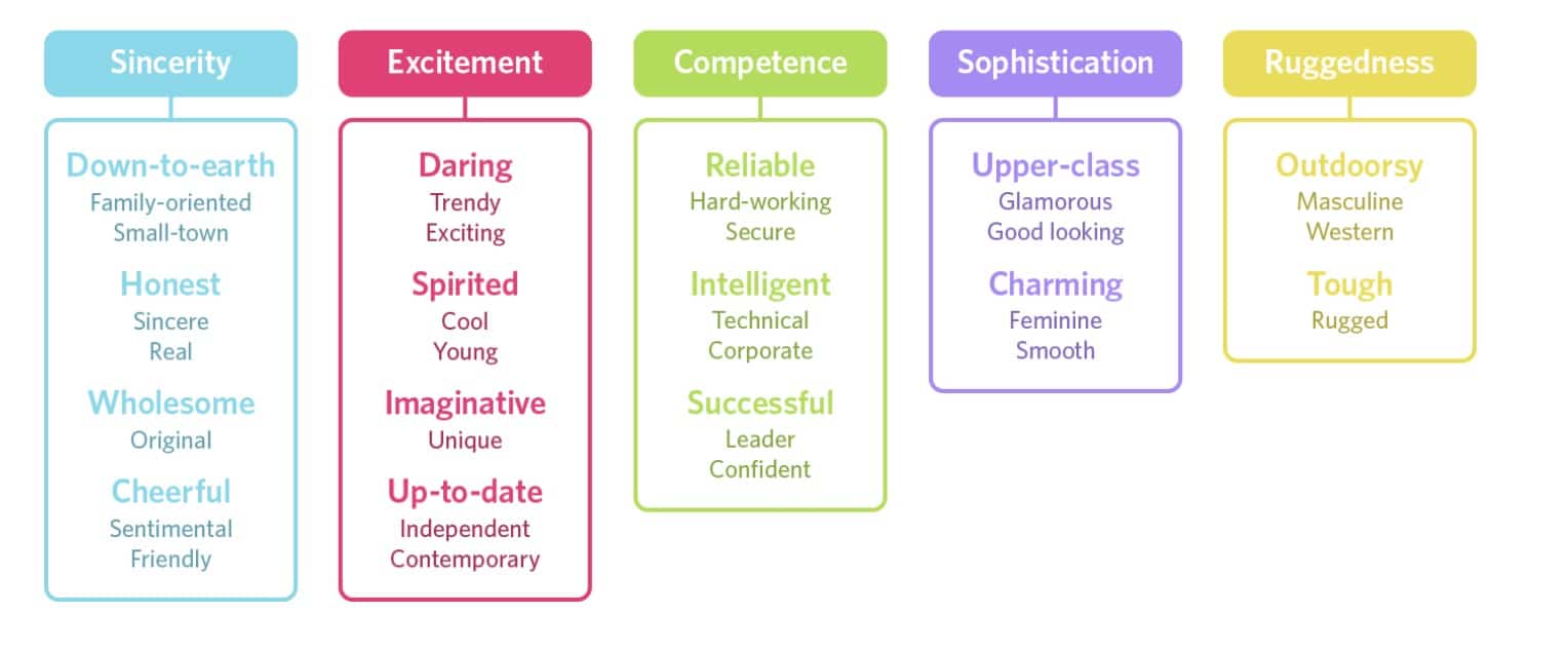
A study by Jennifer Aaker, psychologist, and professor at Stanford University, examined brand worlds to create so-called brand personalities for this purpose. Aaker investigated how brands affect us to derive characteristics we ascribe to colors in a brand context.
Here is an overview of their results in graphic form:
Desired brand impact + color psychology = brand base
This analysis also makes the next step more understandable. Based on this input, we can derive initial proposals for a brand and color world – based on our knowledge of color effects, the target group, and the desired brand world.
With this input, you, as a customer, can simply pick according to your taste, as there is a base provided. [This applies with a caveat: depending on the target audience/budget, etc., it can make much sense to validate the closer selection via a crisp little market research].
Let’s look at some specific examples from our work here, shall we?
What do you associate with this logo?
 And this one?
 Or this one?
![]() Do you feel it?
Do you feel it?
Each of these brands has a different personality.
Often a brand has several characteristics, but one primary character dominates.
How essential colors shape the primary character can also be seen very well in the example of Mcdonald’s.
For decades, the fast-food giant greeted its customers with a bright red and a garish yellow. In 2009, a new logo in dark green was introduced to convey more confidence, sustainability, and health.
A relatively radical image change, ‘only’ visually ‘burned in’ by the new choice of a different color.
From the field: color nuances under the magnifying glass
Getting the color direction right is an excellent first step, but the exact nuances can make a significant difference.
Let’s take a closer look at our practical examples:
For example, with our client, Cleyond, a recycling cleantech company, we recommended a glacial blue representing purity and clarity. The glacier blue is combined with a classic black, as used by brands like Apple, Nike, or Adidas. Black, in turn, conveys strength, control, seriousness, and elegance. Combined with a plain black, the glacial blue expresses what Cleyond stands for: a company with experience and strength in clean recycling techniques.
 A completely different shade of blue, on the other hand, suited our customer FinMarie.
Here, a solid-looking dark blue conveys security, confidence, and down-to-earthiness. Combined with salmon tones(feminine side) and rose gold elements (quality of life), this color combination makes sense for this very brand, as it offers financial advice from women for women.

Tip for B2B brands: Be careful with the blue!
Important tip: Blue and gray are still the colors used by 80% of B2B companies.
Unfortunately, if you choose them, you can quickly get lost in the gray mass!
Especially then, you should seek sound advice to make sure you stand out positively from the competition.
So together with the brand agency, you have laid the foundation and decided on the color palette and logo color. As studies show, this has already achieved a great deal:
The recognition of your brand increases by up to 80% with the right colors.
After the color choice: Time for the “finishing touches”!
By subtleties here are meant the less obvious things, like
- the interaction of text and colors on websites, flyers, offers, etc.
- the design of buttons on the website
- the design of product overviews, infographics, etc.
Think of it a bit like cooking…. Aroma, texture, temperature, and all these elements ultimately make up how a dish works.
To finish this off a bit intimidating 😉
By now you would already guess the risk behind color choices done by taste and mood instead of deeper insights.
Wrong colors can cost you real money.
E.g., consisder your website and the color choices there:
What do the buttons look like on your website? Like the content structure and the interplay of colors? Colors increase the readiness to read on a web page by 40%, and by 73%, colors increase the comprehension of what is read.
Deep dive to ‘ridiculous’ details
Hubspot tested different colors of call-to-action buttons on a web page. The entire website was copied: Everything remained the same except for the buttons visitors could click. For one group, the buttons were kept in green; for the other, they chose red.
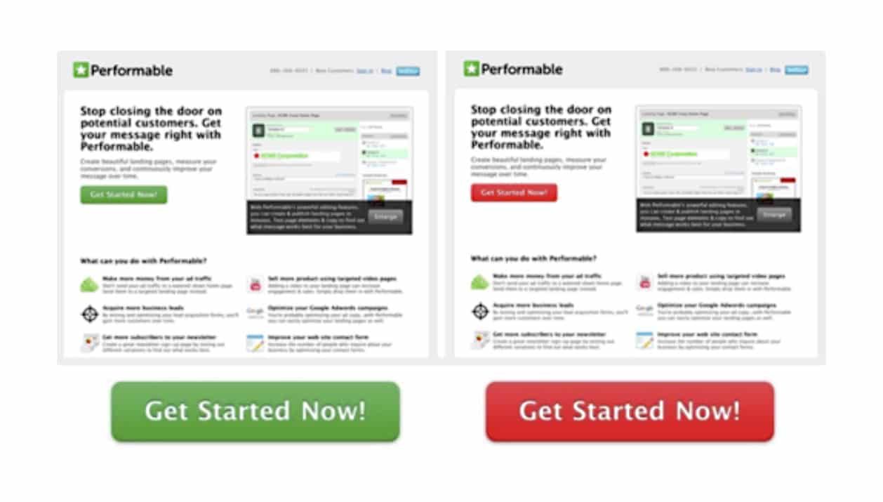 The result:
The red buttons received 21% more clicks than the green ones!
So that’s the 21% more (or less) revenue!
Test, test, test
How to find the color that brings the higher conversion rate, that is, more clicks? And thus more sales?! Shouldn’t this be foreseeable and logical after the explanations above regarding color psychology?
That is the ultimate point of humility for our marketer. Because the truth is:
No one can be really certain how such tests will turn out.
That’s precisely why they make so much sense!
Tip: Get expert advice from someone who knows how to set up sales processes in content, visuals, and IT. We at OVERW8 are also happy to help you, supported by our in-house developer Mahmud Elgohary, perform so-called “split tests.”
Unleash targeted sales power with your color and brand world
Making the “unique” visible to the outside world is a fine art (which our clients and we enjoy a lot :)), and the right color choice is an essential aspect of good branding. Many free tools are floating around on the Internet to create the color palette with one click and let you choose the “right” colors. That can also be exciting for a first inspiration. But in the end, it’s the interaction that counts.
Colors, fonts, graphics, and content are matched with the target group, the market, consumer behavior, and other trends and are used skillfully.
That’s what effective brand development with an agency like us is all about.
In this way, your professionally set up and lived brand can unfold enormous (sales) power.
To learn more about this and similar topics, why not sign up for our newsletter and/or take advantage of an initial no-obligation exchange.


Leave a Reply